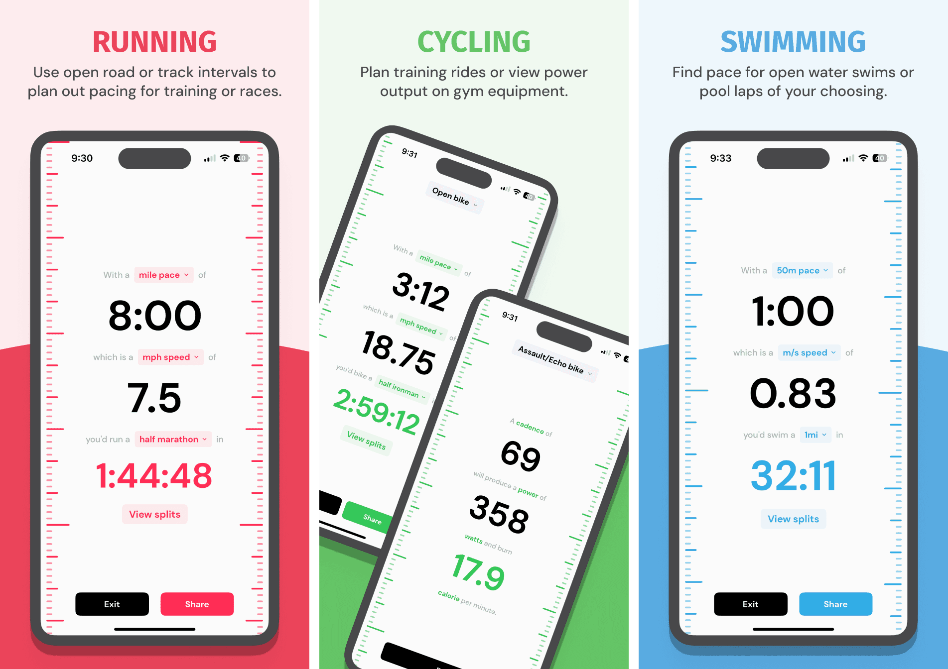
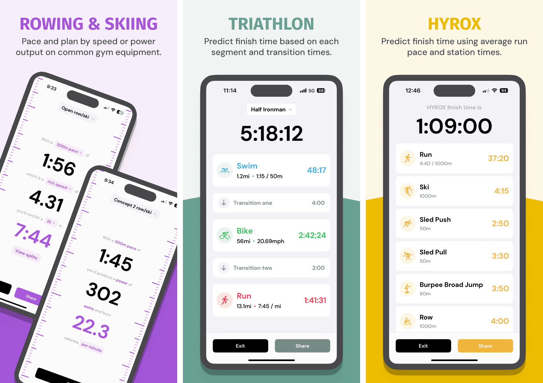
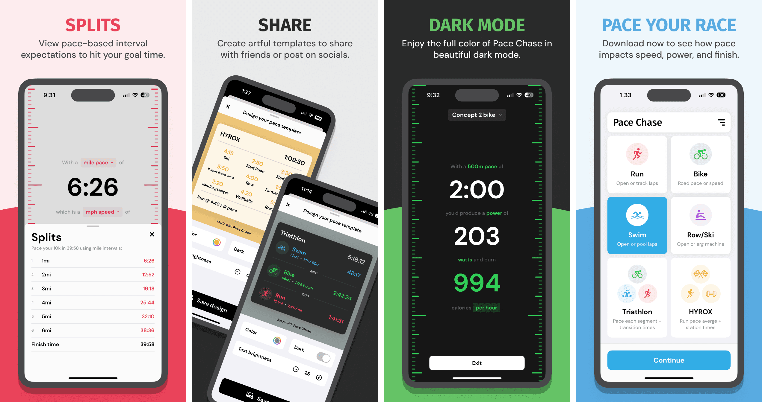
When creating Pace Chase, our process followed a user-centered approach to ensure the app met both functional and aesthetic needs. Here's a breakdown of the journey:
Understanding User Needs
We started by identifying the target audience—athletes and runners—and conducting user research to understand their pain points, goals, and expectations for a pace-tracking tool. This informed the app's core functionalities and design priorities.
Defining the Strategy
Collaborating with my team at Tiger Mind Labs, we developed a clear UX strategy. This included mapping out user journeys, setting design objectives, and aligning the app's features with the overall vision of simplifying pace tracking and visualization.
Designing the Experience
Using Figma, we created wireframes and prototypes to iterate on the app's layout and functionality. We ensured the design was intuitive, user-friendly, and visually engaging, incorporating vibrant visuals and customization options to appeal to a diverse audience.
Testing and Refining
Through usability testing with real users, we identified areas for improvement and refined the design. This iterative feedback loop helped optimize the app's interface, ensuring it delivered a seamless experience from start to finish.
Development Collaboration
I worked closely with my partner to translate the design into a fully functional app. This involved regular check-ins, resolving any technical challenges, and ensuring the final product matched the design intent.
Launch and Feedback
Once the app was live on the App Store, we've been monitoring user feedback and analytics to assess its performance. Post-launch updates focused on enhancing the app based on real-world usage and feedback.
Pace Chase guide


